LEXUS COCKPIT
Selecting Lexus to elevate future EV Driver-focus experience. In this project, I will provide an analysis of how physical controls work along with digital screens and provide a relaxing driving experience.
Time
2021.1 - 2021.6
My Role
Interface Designer
Skills
Unreal Engine (3D Animation & Mockup)
Alias & Blender (3D Model crafting)
Figma
After Effect
Photoshop
Keyshot
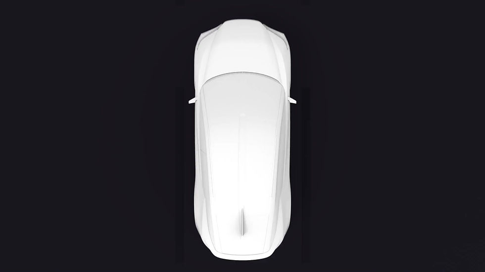
Why LF-Z?
It started for the future of Lexus, also a good starting point to indicate future trends for the LEXUS UI/UX. LF-Z will become the next generation's vision for the EV driving experience. The new cockpit provides the best information exchange system for vehicles, environments, and drivers. Create resonance and connections between cars and people.

the Design Experience for
LF-Z Concept


What is the problem?
Challenge
Minimize distractions: The system should be designed to minimize distractions by placing frequently used controls within easy reach and providing clear and concise information on the screen.
Hands-free operation: The system should allow for hands-free operation using voice commands or other gesture controls to minimize the need for the driver to take their hands off the wheel.
Driver-only access: The system should be designed to limit access to certain functions, such as programming a destination into the navigation system, to the driver only to minimize distractions for the passengers.
Brand Identity: Create a system suited for future Lexus and keep the brand identity. How they represent Essence, Promise, Benefits, and Personality. To create the finest luxury vehicles, we also have to focus on digital experiences for future drivers.
Heuristic Evaluation
PREVIOUS LEXUS INTERFACE
- Overwhelming abundant information.
- Too many steps to learn and activate voice control.
- Lack of visual layer and hard to focus.
- Interface is completely out of date and does not represent Lexus Brand.
- Notifications are taking over the entire screen and are affecting driving.
- Hard to connect and control the infotainment.
- Too many useless steps to create complexity.
Learning from the current design and studying previous models what to provide and where we should be building from. This design challenge was to compose an appropriate user experience for the Lexus Future Electric Vehicle.

As an indication of the future image of a "Tazuna" cockpit, the "LF-Z Electrified" employs next-generation interfaces, such as AI assistant and enhanced presentation of vehicle information through AR (augmented reality). while creating a strong emotional connection by improving the human experience for the driver and passengers.
Brand Research
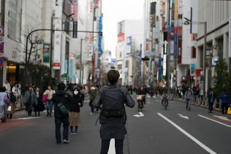
Lexus owner enjoy the luxury experience and excited driving feeling. But they are not Diverting your attention from complicated dashboards, buttons and giant tablet screens to the exciting world. They need simplicity and enhanced driver and passenger experience.
User Research
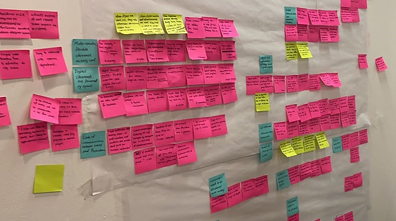
RESEARCH
Pain Point
Define the target audience's needs from previously conducted reviews and research.
We narrow down some essential needs from them, which helps us to deliver app based on demand.
User Research
QUESTIONAIRE & INTERVIEWS
To better understand how Lexus drivers are willing to drive future EV Lexus and identify potential problems, I advocated for conducting several methods to research before diving into solutions. By holding quantitative research to understand the big picture, and qualitative research to find out each details pain points.
Quantitative Research

QUESTIONAIRES
I conducted quantitative user questionnaires to get general pain points and insights from the public about current user behavior patterns with car interfaces.
Meanwhile, and understanding the communication process and control methods with their vehicles. Every situation is not without its own unique needs, and we value the necessary connection between drivers and vehicles.

Qualitative Research
INTERVIEWS

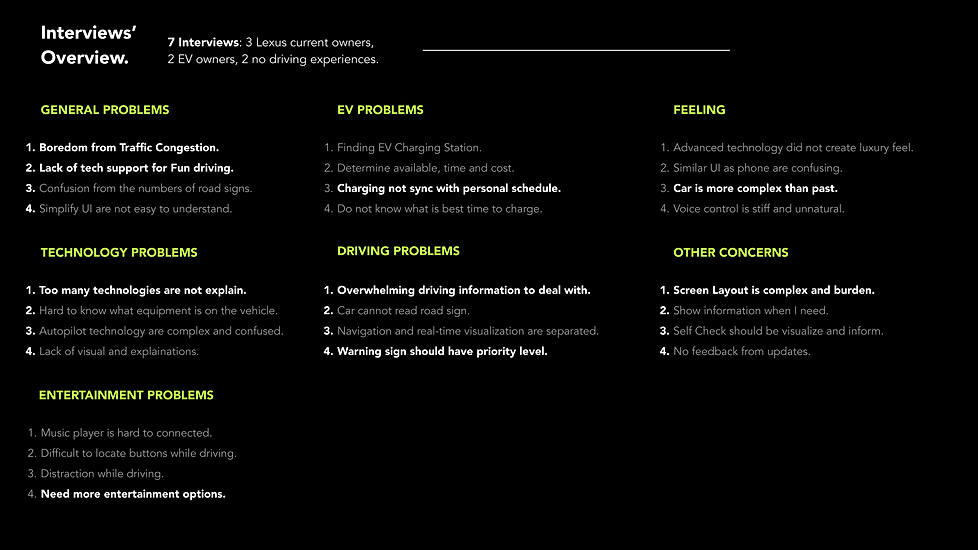
Going deeper inside of customers' details, I also conducted more details interviews with qualitative methods, which are offering more rich, more in-depth insights about how they currently drive Lexus or EVs, understand their patterns, and regarding their driving paths to work, shopping, or leisure road trips. I have conducted 7 semi-structured user interviews with varied demographics of people to understand their motivations, pain points, and needs.
Highlights
FROM INTERVIEWS
Following the discovery research, I was able to gather information to share what my learning and align on outcomes. As the researcher,
-
Learn about the user's demographics, behaviors, motivations, goals, and pain points for previous research.
-
Identify common traits and characteristics that are shared by many of the users. This can involve looking for patterns and trends in the data and identifying common characteristics such as age, gender, occupation, interests, and goals.
-
Once the common traits and characteristics have been identified, the next step is to create a detailed profile for the persona.
-
Using the persona's perspective to help make decisions about the product or service.
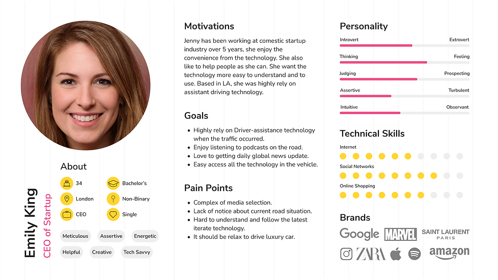
To better guide our design and enable everyone on the team to empathize with our users, I further synthesized the interview results and came up with the following personas.
Persona
INVESTIGATION
I interviewed 7 people who have been experiencing driving/riding EV (Electric vehicles), from car enthusiasts to non-experienced riders. And I found that:
-
The boredom of driving in the traffic (All the attraction has to focus on the immediate stop)
-
International students usually want to see pictures of the food, but that is not always available on the menu.
-
Some people want dish recommendations from those who have similar ethnic backgrounds as they do; others want recommendations from those who are familiar with the dish.
-
Some people have difficulties pronouncing dish names, which can be embarrassing in front of American friends.
-
Because of these difficulties, a number of internationals choose to stick to familiar dishes when ordering in these restaurants; others end up not visiting these restaurants at all, even when invited by their American friends.

Empathy Map
RESEARCH
Visualizing user attitudes and behaviors in an empathy map helps UX teams align on a deep understanding of end users. The mapping process also reveals any holes in existing user data by capturing their emotional feelings.
- Remove bias from our designs and align the team on a single, shared understanding of the user.
- Discover weaknesses in our research.
- Uncover user needs that the user themselves may not even be aware of.
- Understand what drives users’ behaviors.
- Guide us toward meaningful innovation.

CURRENT
User Journey Map
A journey map is a visualization of the process that a person goes through in order to accomplish a goal. It reveals opportunities to address customers’ pain points, alleviate fragmentation, and, ultimately, create a better experience for the potential users.

IDEATION
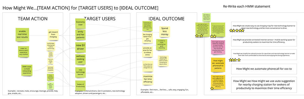
How might we...
Using previous knowledge to frame design challenges. To prevent individuals from suggesting their pet solutions, which might have little resemblance to the problems found, construct How might we questions that frame the problem(s) for ideation.
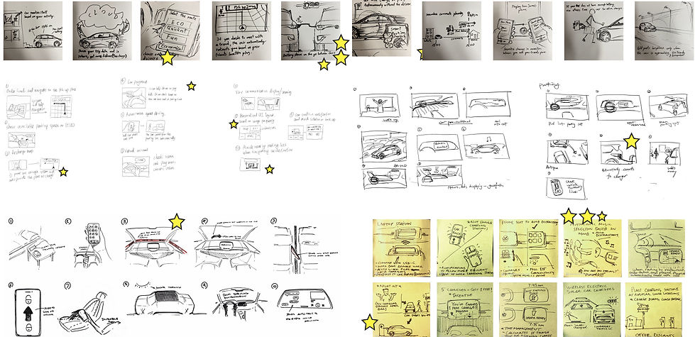
Ideation Sketch
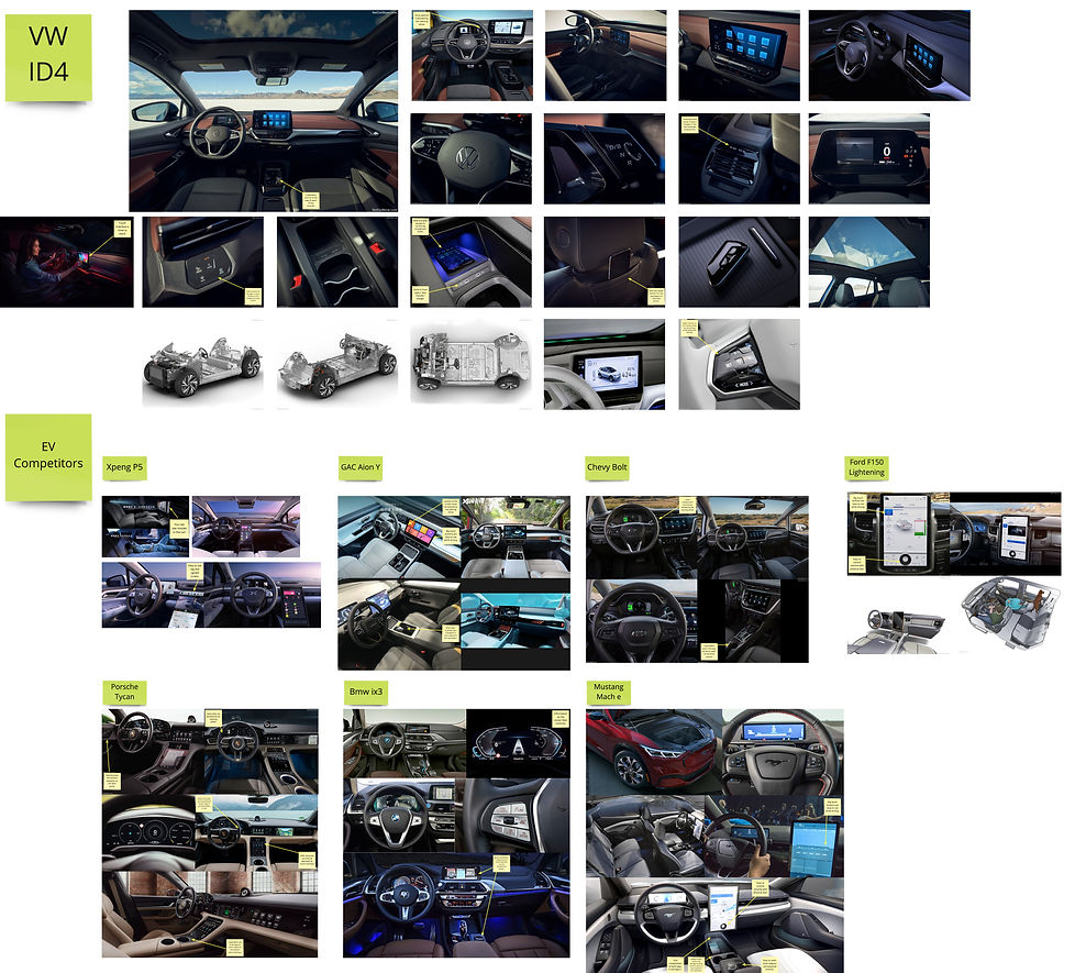
Competitive Analysis
Investigate & Comparing the Current competitive EVs cockpits.
EXPANDING HORIZONS

SHARING
EXCITEMENT

CONNECTING
EXPERIENCES
New User Journey Maps
Showing the steps the user takes, the emotions they experience, and the touchpoints they have with the company. User journey maps are used in user experience (UX) design and research to understand the user's perspective and identify opportunities for improvement.

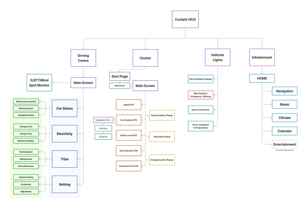
Information Architecture
Information architecture (IA) focuses on organizing, structuring, and labeling content in an effective and sustainable way. The goal is to help users find information and complete tasks. And need to understand how the pieces fit together to create the larger picture and how items relate to each other within the system.
Visual Library
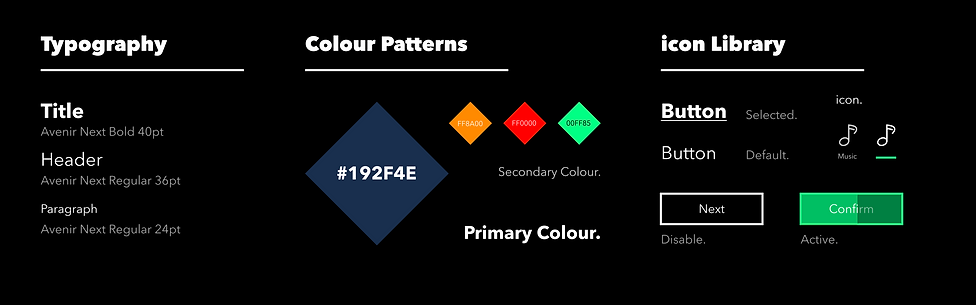
The text content represents more than 80% of the design, so understanding typography is crucial. I always put readability first. Using descriptions texts and icons as buttons to help people more quickly understand the features.
Ideation

Voice Control is not the ultimate solution.
While voice control seems the ideal choice, there are situations where, according to studies, the mental work-load can be higher than expected. It was truer on older systems, where VUI wasn’t really “conversational”, modern assistants, such as Google Assistant or Siri, have a much higher degree of understanding longer strings of information, reducing the mental effort to phrase commands.
Nonetheless, we should consider situations where talking might not be an option, for example, when a baby is sleeping in the backseat, or someone has a speech impairment, and provide a safe and visual/tactile way of performing all the actions.

Readability
Unlike a mobile device or even your office setup with a desktop computer and a chair, in a car, the seat is at a fixed angle relative to the screen, which is also fixed in place. For this reason, it is essential to consider the reachability of the screen and its readability. Considering a left-seated driver, elements on the right side of the screen result less readable and reachable (the opposite, of course, happens in cars with the steering wheel on the right side).
RoadMap
NEW FEATURES

By gathering inputs from literature review and partner teams, I was able to pull together several different concepts. I then drove alignment with product leadership, eventually landing on a single mental model.
Using logical flow as structures created 5-level hierarchies, which helped develop low-fidelity prototypes.
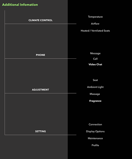
Additional Setting Features
Understanding the interface ideas, and began the concept's evolution to digital space by meticulously refining maps and wireframes,.
And with so many content elements and a large array of user-configurable settings within the automotive experiences, the wireframes ensure that fulfilled the needs.
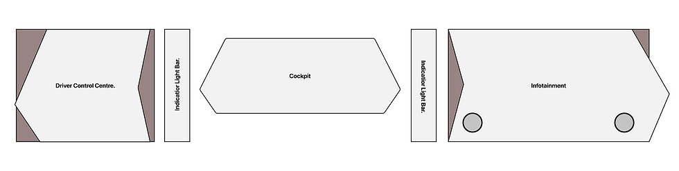
Wireframe
1. Driver Control Centre
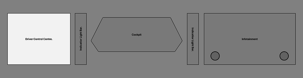
The driver control center contains all the driving information that is easy to access for the driver. Also, the control center is adapting to the user's needs. You could choose which will be displayed on the screen. A huge number of customizable widgets could help you with those.
2. Indicator Light Bar
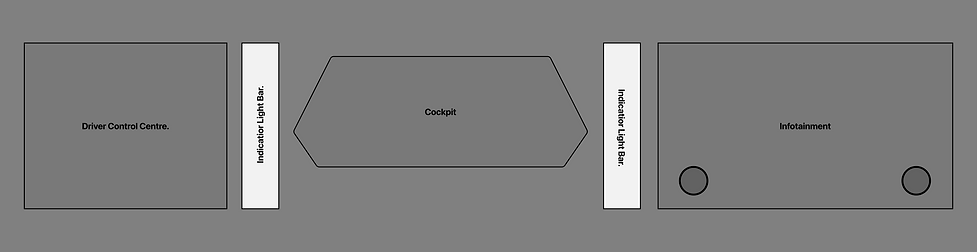

Visual indicators are one such example. A visual indicator light is a “marker” that helps users quickly locate the current situation without details checking in the information system. Performing the best out of all the variations for all UX metrics we measured.
3. Cluster Design
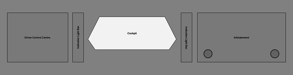

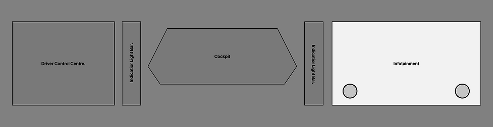
4. Infotainment Centre


User Testing
With my goals for this iteration in mind, I moderated user feedback sessions with 5 users with different attitudes toward trying new food and different levels of familiarity with Mexican cuisine (the example I used in my prototype). Here's a brief overview of the process:
- Introduce the project goal, and put users at ease.
- Describe the scenario, set up the context, and let users use the app while thinking aloud.
- Ask follow-up questions and gather feedback.
- Let users fill out a questionnaire. Thank them for their participation.
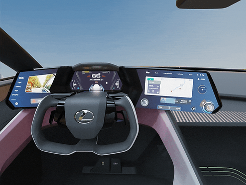
High Fidelity
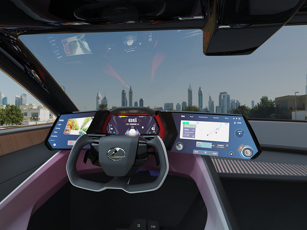
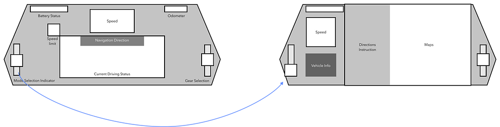
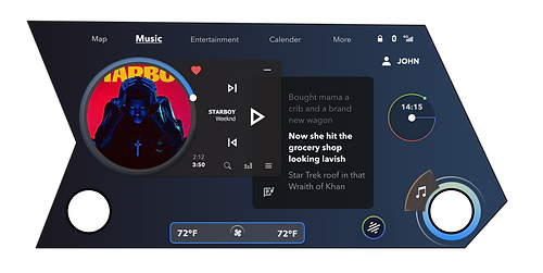
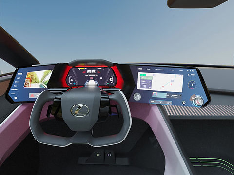
In-Car Experience - Driver's Center

Driver Center
Car user interfaces must be clean and minimal, with large text, toggles, and buttons so users can use them with no more than a glance. UX designers must work with interior automotive design teams to match the user experience to the driver’s reach, line of sight, left vs. right-hand drive, etc.–all elements that could impact driver safety.
High Fidelity
In-Car Experience - Cluster

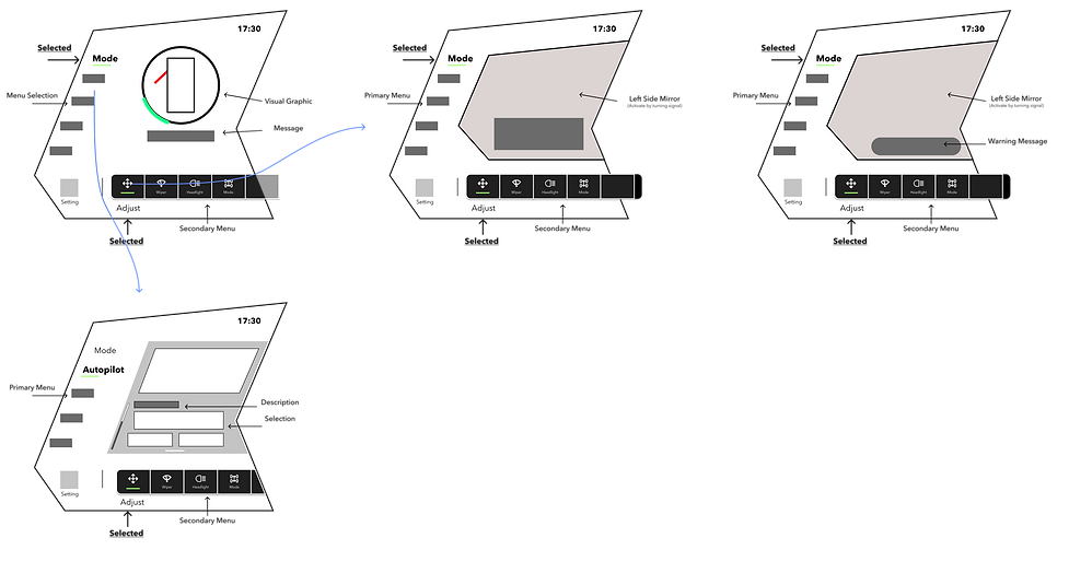
LEVEL 2 FEATURES
TURN PANEL
Build-in Blind Spot Monitor, to provide real-time road status to help drivers understand the situation.

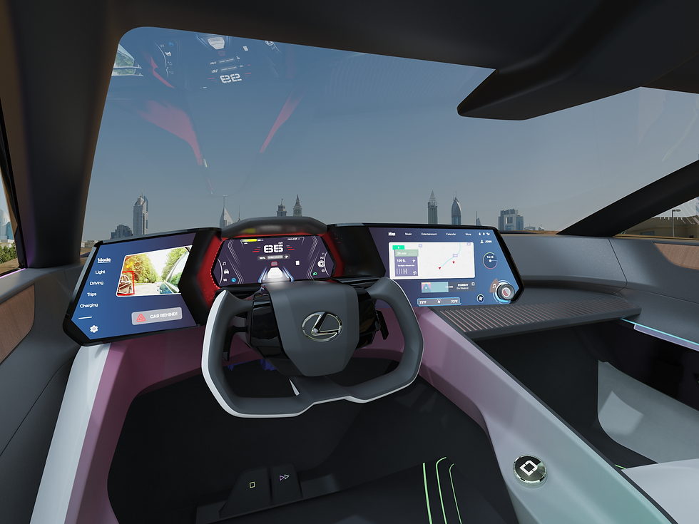
LEVEL 2 FEATURES
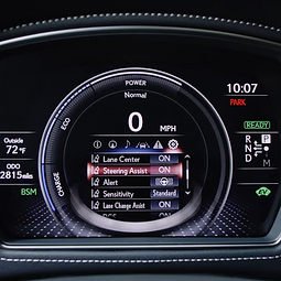
Auto Pilot
Lane Keeping System: Provide minimized visuals to demonstrate the current situation.

LEVEL 2 FEATURES
City Drive
Build-in sensors and rendering systems to provide real-time road status to help drivers understand the situation.

High Fidelity
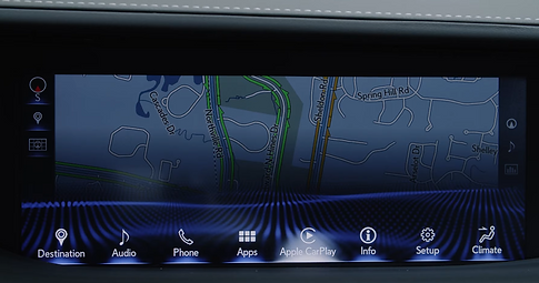
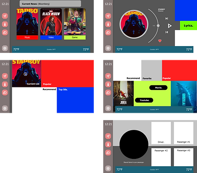
In-Car Experience - Infotainment
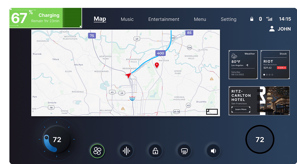
Based on the research and readability testing, I have designed a new Notification Bar to highlight the current situation. Using AI prediction, what information may need to be shown, such as Navigation Info, Charging Status, Destination Info, Finding Parking, etc. Without bothering the main contents.
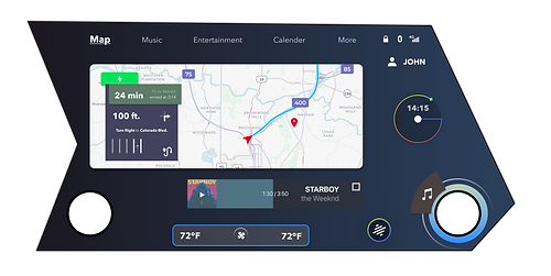
Map view
Music view
FINAL MOCKUP
Animation & Interaction

Left Turn instrumental signal
Right Turn instrumental signal

Emergency Alerts
Autopilot Engage